
Project Showcase
Snapshots of infographics, lesson designs, Instructional Design Decks, and a engagement initiative that work together to shape learning in adults and children.
Infographics & Documents
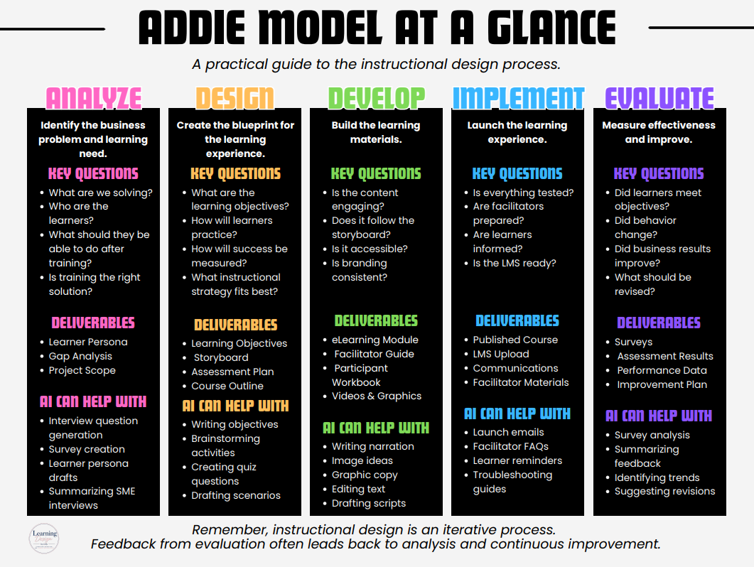
Project: ADDIE Model at a Glance
Reference poster / job aid | Canva | 24 x 18 in
The problem: Instructional designers — especially those newer to formal ID work — need a fast, reliable reference for the ADDIE framework that goes beyond dictionary definitions and shows what each phase actually produces and how AI tools can support the work.
My approach: I broke the ADDIE model into a five-column, at-a-glance format covering Analyze, Design, Develop, Implement, and Evaluate. Each phase includes the core purpose, key questions to ask, expected deliverables, and — as a practical, current-relevance layer — where AI can realistically assist (e.g., drafting learner personas, generating quiz questions, summarizing survey feedback). This turns a standard framework reference into a tool someone could actually use mid-project, not just study once.
Design choices: A bold, high-contrast color-coded system (one color per phase) makes the poster scannable at a glance, even at a distance — appropriate for its use as a physical 24×18 reference poster. Black content blocks against a light background keep each phase visually distinct while maintaining a consistent structure across all five columns, and the closing note ties the poster back to ADDIE’s iterative nature rather than presenting it as a rigid linear process.
Tools: Canva
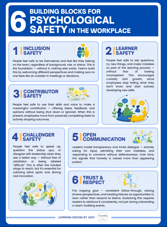
Project: 6 Building Blocks for Psychological Safety in the Workplace
Reference poster / job aid | Canva | 6 building blocks
The problem: Psychological safety is widely cited as a driver of team performance and innovation, but the concept often stays abstract for managers and leaders — easy to nod along to in a workshop, hard to translate into specific day-to-day behaviors that build or erode it.
My approach: I broke down Amy Edmondson’s psychological safety framework into six concrete building blocks — Inclusion Safety, Learner Safety, Contributor Safety, Challenger Safety, Open Communication, and Trust & Respect — sequencing them from foundational (feeling like you belong) to advanced (feeling safe to challenge leadership). Each block pairs the concept with a plain-language description of what it looks like in practice, so a manager can recognize both the behavior to encourage and the failure mode to watch for, like employees hiding what they don’t know or leaders reacting defensively to pushback.
Design choices: A numbered, color-coded card layout lets the poster function as a quick reference rather than something read start to finish — a manager could scan straight to “Challenger Safety” mid-conversation. Consistent iconography and a bold, high-contrast palette keep it readable as a physical poster, while the progression from foundational to advanced blocks subtly reinforces that psychological safety is built in stages, not achieved all at once.
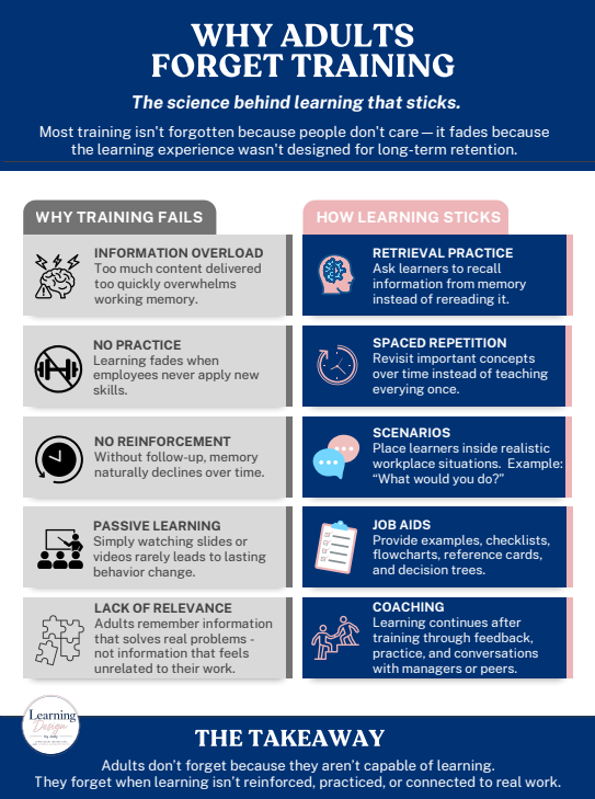
Project: Why Adults Forget Training
Reference poster / job aid | Canva | Learning science overview
The problem: Organizations invest heavily in training, but retention often fails silently — employees sit through sessions and forget most of it within weeks. Without understanding why training fails, L&D teams tend to fix the wrong thing (more content, better slides) instead of the actual gap (no practice, no reinforcement).
My approach: I structured the poster as a direct comparison — five common reasons training fails paired one-to-one with the learning-science-backed practice that addresses it. Information overload maps to retrieval practice, passive learning maps to scenario-based practice, lack of reinforcement maps to coaching — so the poster doubles as both a diagnostic tool (what’s going wrong) and a design checklist (what to build instead) for anyone creating training.
Design choices: A two-column layout with contrasting colors (gray/problem vs. navy-pink/solution) makes the cause-and-effect relationship visually immediate without needing arrows or extra explanation. Consistent iconography anchors each row for quick scanning, and the closing takeaway reframes the whole poster around a mindset shift: forgetting isn’t a learner failing, it’s a design gap — a subtle but important point for an L&D audience to internalize.
Tools: Canva
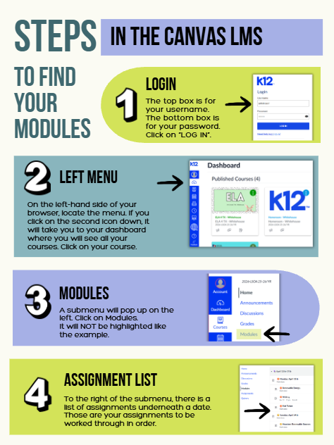
Project: Steps to Find Your Modules in Canvas LMS
Student-facing job aid / how-to guide | Canva | 4 steps
The problem: Students (and often parents) navigating a new LMS need a fast, visual way to locate their coursework — without a support ticket or a phone call to the teacher. Text-only instructions tend to get skipped or misread, especially for a multi-click process across several screens.
My approach: I broke the login-to-assignments workflow into four numbered, sequential steps, each paired with an annotated screenshot of the actual interface so students can visually match what they see on their own screen to the instructions. Arrows point directly to the click targets, and each step calls out details that commonly trip students up — like the modules link not being highlighted the way the example shows.
Design choices: A bold number badge anchors each step for quick scanning, and alternating background colors visually separate the four stages so the eye can track progress down the page. Real interface screenshots (rather than generic icons) were used deliberately, since the goal is recognition — a student should be able to glance at their own screen and immediately match it to the guide.
Tools: Canva
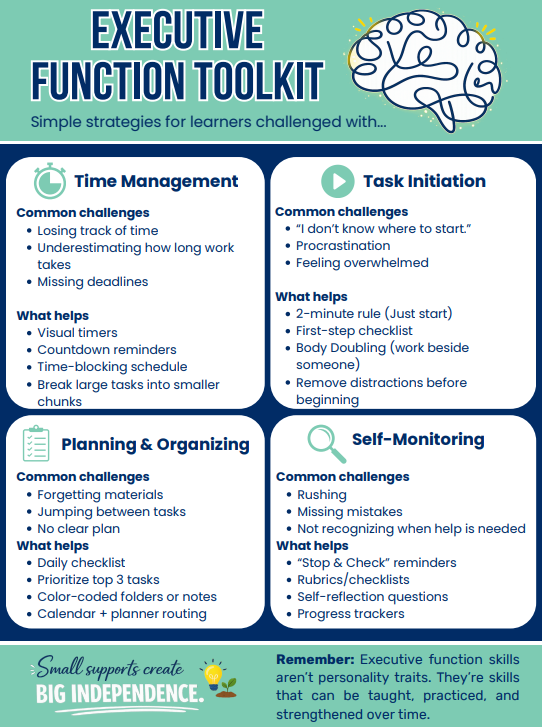
Project: Executive Function Toolkit
Reference guide / job aid | Canva | 4 skill areas
The problem: Professionals often know a co-worker or student is struggling with executive function — losing track of time, not knowing where to start, missing steps — but don’t have a quick, practical reference connecting the challenge to a concrete strategy in the moment.
My approach: I organized the toolkit around four core executive function skill areas — Time Management, Task Initiation, Planning & Organizing, and Self-Monitoring — pairing each with the common challenges that show up in a workplace or classroom and specific, low-lift strategies that address them (like the 2-minute rule for task initiation or body doubling for focus). The framing deliberately treats these as teachable, strengthenable skills rather than fixed traits, which shapes how a co-worker or teacher approaches intervention.
Design choices: A clean quadrant layout lets a user scan straight to the relevant skill area under time pressure, with consistent iconography and a shared challenge/strategy structure across all four sections so the format stays predictable. The closing message reinforces the toolkit’s core premise — small supports build independence — rather than framing these students as needing constant accommodation.
Tools: Canva
Instructional Design Decks
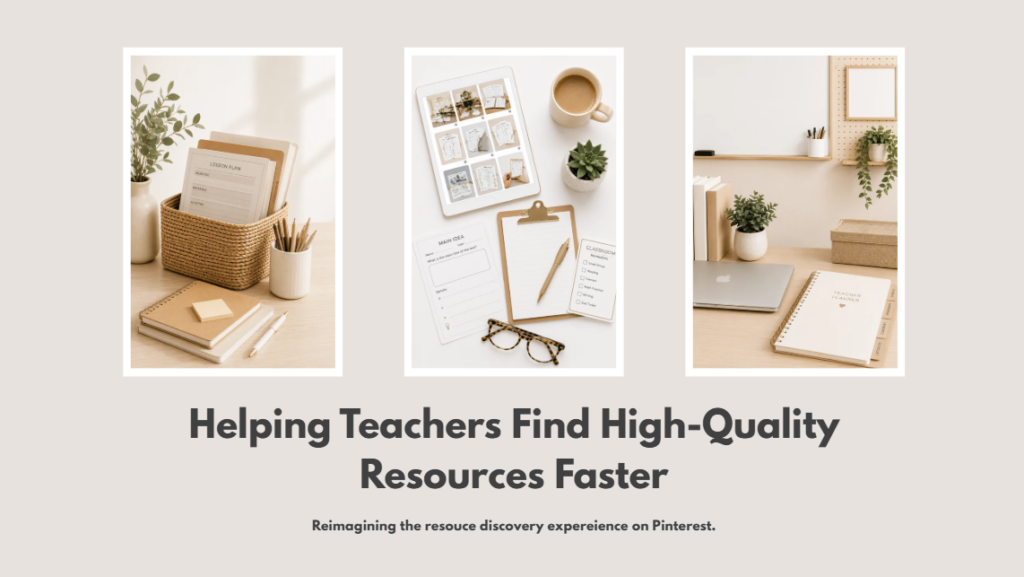
Project: Helping Teachers Find High-Quality Resources Faster
Problem/solution case study | Canva | 5 slides
The problem: Teachers use Pinterest constantly to find classroom resources, but the platform’s generic search surfaces thousands of results with no way to judge quality upfront — outdated content, wrong grade levels, standards misalignment, and no previews. The result: teachers spend more time hunting than teaching.
My approach: I mapped teacher pain points through interviews and search-behavior observation, then defined what teachers actually needed — better filtering, richer previews, and built-in organization — before moving into wireframes and UI design. The solution reimagines Pinterest’s discovery experience specifically for educators: smart filters by grade, subject, standards, and reading level; rich previews so teachers can evaluate a resource before clicking in; auto-organized collections by instructional category; and contextual notes on saved pins (e.g., “use next week,” “review before benchmark”).
Design choices: I followed a four-stage process — Discover, Define, Design, Refine — refining toward simplified navigation, reduced visual clutter, a neutral color palette, and large touch targets for accessibility. Every decision traces back to four principles: empathy for real teacher workflows, clarity before the click, sustainable organization, and efficiency through fewer clicks.
Tools: Canva
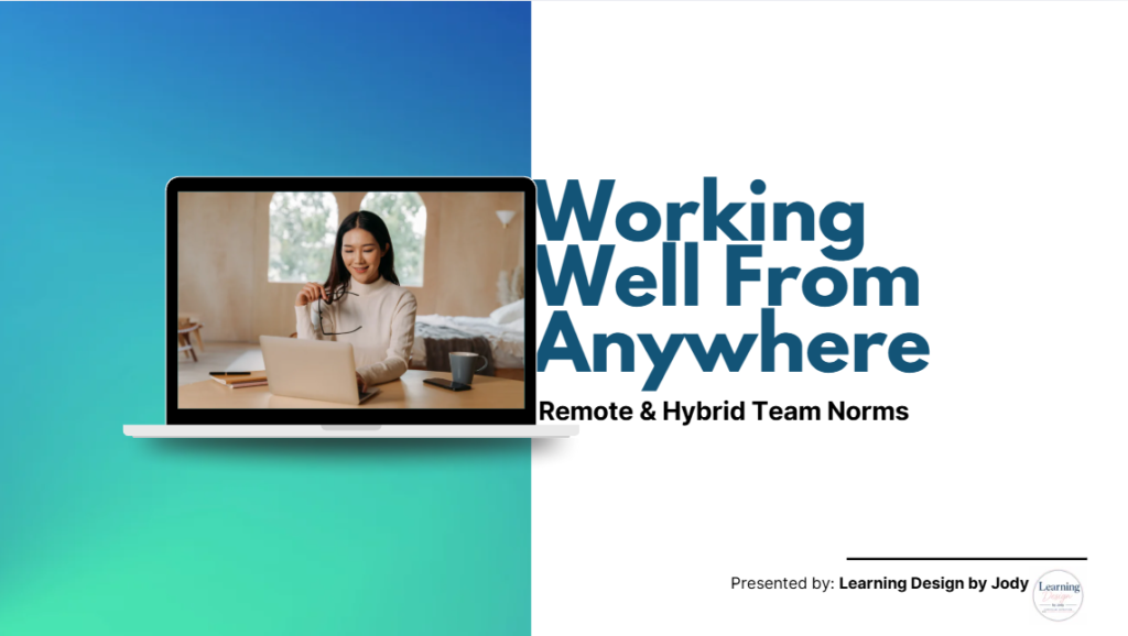
Project: Working Well From Anywhere — Remote & Hybrid Team Norms
Reference deck / job aid | Canva | 14 slides
The problem: Remote and hybrid teams often operate without shared norms for communication, meetings, and visibility — leading to misread silence, meeting fatigue, and eroded trust between teammates who are rarely in the same room.
My approach: I designed a concise, scenario-driven reference deck that translates common remote-work friction points into clear, actionable norms. Drawing on six years of fully remote work experience, I grounded the content in real situations — like a delayed Slack reply being misread as disengagement — rather than generic best-practice lists, to keep it credible and immediately usable for teams adopting hybrid work.
Design choices: Content is structured to move from problem (a relatable “day gone wrong” scenario) to practical framework (sync vs. async decision table, meeting hygiene checklist) to tangible takeaway (a fillable Team Working Agreement template teams can adapt on the spot).
Tools: Canva
Note: This is a static reference deck, not an interactive e-learning course. A future iteration in Rise 360 would add branching scenarios and knowledge checks to build in practice and reinforcement.
Articulate 360 Decks (Coming Soon!)
4th Grade Novel Study
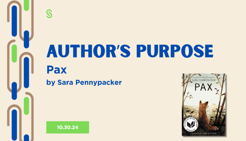
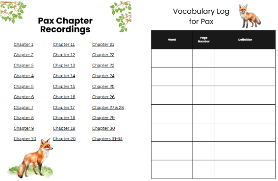
Project: Author’s Purpose, Making Connections & Theme — Pax
3-day live-instruction lesson (Canva slides + Classkick interactive companion) | 4th grade ELA
The problem: Fourth graders need to progress from identifying an author’s purpose, to connecting a text’s message to their own experience, to independently discovering theme through conflict — a skill progression that’s easy to state as a standard but hard to teach in stages, each reinforced by the same anchor text, within a strict 45-minute live-instruction window per day.
My approach: I built a three-day lesson sequence anchored in Pax by Sara Pennypacker, sequencing STAAR-style warm-ups, direct instruction, and guided practice each day, with each day targeting a distinct TEKS standard while building on the day before. Day 1 targets author’s purpose and message (4.10A), using a comic strip and a real-world reading passage to build the concept before applying it to Pax‘s themes of friendship and loyalty. Day 2 shifts to making connections (4.6E), reviewing plot structure with a Cinderella example, then using a Justin Timberlake song lyric alongside the novel to practice connecting a text’s message to outside experiences and society — a deliberate move to keep 4th graders engaged with material outside the textbook. Day 3 introduces theme — discovered through conflict rather than stated directly — using an interactive watch-along of a short animated film before transferring the skill back to Pax.
Design choices: Slides were built in Canva for whole-class instruction, while a separate Classkick experience handled the interactive layer, giving students a space to actively respond and work through activities during live class rather than just watching — from the Day 1/2 plot diagram and inference work, to a real-time Day 3 “theme tracker” where students log conflict and character realizations as the film plays, scaffolding them toward independently stating a theme before applying it to Pax and practicing it solo on an exit ticket. QR-code exit polls (“This is my jam” / “I don’t get this YET” / “I need more practice”) gave a low-stakes, kid-friendly way to self-assess understanding at the end of each session. Both the Day 2 song and Day 3 video were sourced via YouTube rather than embedded directly, working around Canva’s licensing restrictions on copyrighted media.
Tools: Canva, Classkick
4th Grade Writer’s Workshop
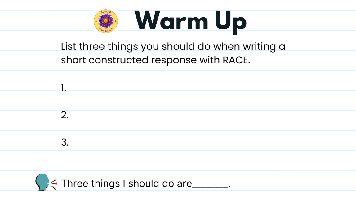
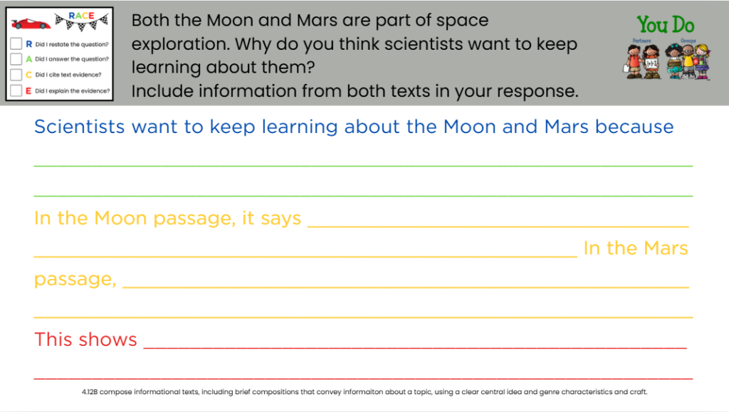
Project: RACE Paired Passages: Writer’s Workshop
4th Grade ELA Lesson | Canva + Nearpod | 45-min synchronous lesson
The problem
Students needed to move beyond writing a RACE response to a single passage and start synthesizing information across two related texts — a heavier lift that combines close reading, comparison, and constructed response in one task. At the start of second semester, I wanted a lesson that reviewed the RACE strategy while raising the rigor: instead of restating one text, students had to pull evidence from two informational passages (The Moon and Mars) to answer a synthesis question.
My approach
I built the lesson using a gradual release model — I Do, We Do, You Do — so students moved from guided practice with heavy scaffolding to independent application with scaffolding faded out. The lesson opened with a warm-up to activate prior RACE knowledge, then modeled reading both passages aloud before releasing students into gamified table teams (each named after a favorite video game) to complete a Venn diagram and draft a shared RACE response in Nearpod. Team roles (Captain, Question Reader, Time Keeper, Reporter, Participant) kept every student accountable during collaborative work. The lesson closed with three tiered exit tickets on an independent narrative passage, so I could see who had transferred the skill without support and who needed more scaffolding — feeding directly into a color-coded self-evaluation and reteach grouping.
Design choices
- Used a consistent RACE checklist graphic throughout so students could self-monitor each step (Restate, Answer, Cite, Explain) as they worked
- Built in three levels of scaffolding on the exit tickets — full sentence starters, partial starters, and none — to differentiate for readiness without changing the task itself
- Framed the objective against a Bloom’s-style rigor ladder so students could see that “compose” is higher-order thinking, not just a recall task
- Used a Venn diagram as a thinking scaffold between reading and writing, so students had to process the comparison before drafting
- Added a self-evaluation slide with color-coded next steps (green/yellow/red) to make differentiation transparent and student-driven
- Included a peer critique extension (Glows/Grows) for early finishers to build revision skills rather than just filling time
Tools
Canva (slide design), Nearpod (student writing and submission)
4th Grade ELA 1:1 Hour Session
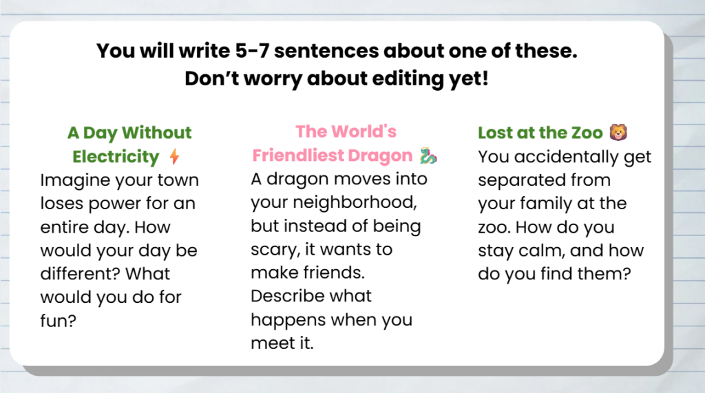
Word Wizard: Complete Sentences
4th Grade ELA 1:1 Session | Canva + Classkick | 60-min synchronous lesson
The problem
This student had built a solid handle on subjects and predicates in our last session, but was still struggling to apply that knowledge to run-on sentences and editing — the harder, more independent end of the skill. In isolated practice, they could label a subject or predicate correctly, but when faced with a wall of unpunctuated text, they weren’t sure where one sentence ended and the next began. I wanted this session to close that specific gap: not reteach the definitions, but give them enough repetition with run-ons and real editing tasks that they’d start trusting their own ear for where sentences break.
My approach
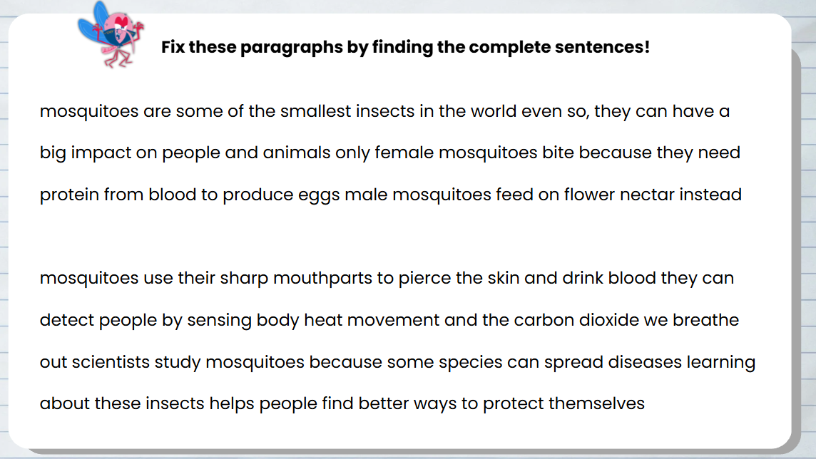
I used a shortened, review-focused version of a complete sentences lesson I’d built, cutting the initial concept teaching since they already had that foundation, and spending most of our time in the diagnostic and editing stages. We started with a quick refresh using the Complete Sentence Checklist, then moved straight into identifying what was wrong with a set of example sentences — some fragments, some run-ons — so I could see exactly where their reasoning broke down. From there we tackled the harder task: two full paragraphs about mosquitoes with no capitalization or punctuation, which forced them to read for meaning rather than rely on visual cues like periods that weren’t there yet. I had them read the paragraphs aloud, since hearing where their voice naturally paused helped them find sentence breaks they were missing on the page. We finished with a short low-stakes writing prompt, intentionally separating drafting from editing so they weren’t trying to fix mechanics and generate ideas at the same time.
Design choices
- Skipped re-teaching subject/predicate definitions and went straight to application, since the gap was in transfer, not concept knowledge
- Used the same Complete Sentence Checklist from the prior session so the review felt continuous rather than like starting over
- Chose real, connected paragraphs (not just isolated sentences) for the editing practice, since that’s where the student’s actual difficulty showed up
- Had the student read their editing work aloud, using their own voice as a tool for hearing sentence boundaries rather than only looking for visual punctuation cues
- Kept the final writing task low-stakes and explicitly separate from editing, so one shaky skill didn’t block their confidence on the other
Tools
Canva (adapted from a full-class lesson for 1:1 use), Classkick
Engagement Initiative

Project: Pet Adoption Incentive Program
Classroom engagement system / goal-setting initiative | Canva | ClassDojo integration
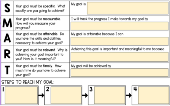
The problem: Students often disengage from academic goal-setting when it feels abstract or disconnected from daily classroom life — SMART goals get written once and forgotten, and there’s little sustained motivation tying day-to-day effort (participation, assignment completion, academic growth) to something students actually care about.
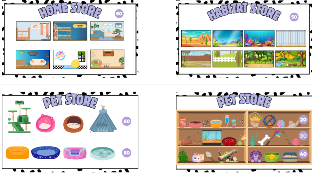
My approach: I created a Pet Adoption Incentive Program where students write an academic SMART goal targeting a specific skill or behavior, then “adopt” a virtual pet they build and grow throughout the year. Students earn ClassDojo points through class participation, assignment completion, and demonstrated academic effort, which function as currency to purchase virtual habitats, accessories, and other items for their pet. I later expanded the program into a full classroom economy system, adding a weekly goal-reflection component where each student met with their learning coach to evaluate progress, discuss challenges, and identify next steps — tying continued program participation directly to consistent goal monitoring.
Design choices: Habitats, pet stores, and adoption materials were built in Canva as a cohesive, personalized visual world — students select and decorate their own space, which gives the incentive system a sense of ownership rather than a generic point tracker. The adoption application and goal-tracking documents were designed to mirror real-world processes (an actual adoption application format), reinforcing responsibility and follow-through as core parts of the metaphor, not just decoration.
Impact: The program increased student engagement and accountability by 75%, strengthened home-school partnerships through the weekly learning coach check-ins by roughly 60%, and gave students a tangible, motivating way to connect daily effort to academic growth.
To measure impact, I tracked ClassDojo participation data — points earned and assignment completion rates — before and after launch, alongside goal-progress from learning coach check-ins. This structure made it possible to see, at a glance, whether engagement was translating into actual skill growth and goal completion, while parent feedback from phone call and conferences added a qualitative layer beyond the point totals.
Tools: Canva, ClassDojo